Being in business today is tough. It’s no longer enough to meet your client’s expectations; you must exceed them. If they’re surfing the web at three in the morning with a burning question about your business, they expect you to answer it.
Regular business hours don’t mean much in the online society we live in. What does count is that if your company can’t provide the client with the answers they want, someone else will! But, before you start looking for staff to work the graveyard shift, there’s an easy answer –chatbots.
With a well-designed chatbot in place, clients can get simple queries answered in seconds,24/7. The customer gets the answers that they need at a time convenient to them. There’s no need for them to disappear off to a competitor’s site. It’s good news for the business as well. The chatbot can handle those annoying, repetitive queries while employees focus on other tasks.
The key here is that the chatbot must be well-designed. It must operate flawlessly—ideally, the person on the other end should believe that they’re dealing with a human.
Getting a Well-Designed Chatbot
Having a chatbot designed used to be quite an expensive process. When chatbots first came about, it required some serious coding skills to get them to work flawlessly. That kind of experience and skillset came at a high cost, putting chatbots out of reach for smaller enterprises.
Fortunately, that’s changed over the last few years. Hiring someone to design the perfect - chatbot is still pricey. But you don’t have to hire a designer. Our platform walks you through the process step by step.
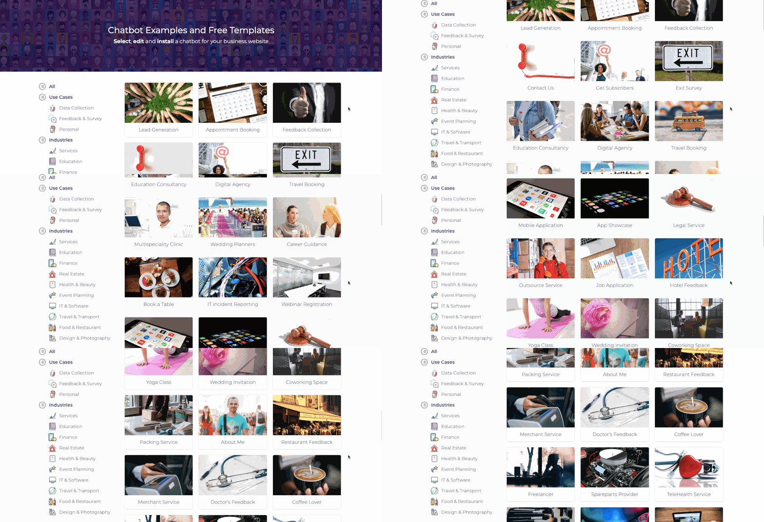
You don’t have to worry about the backend programming at all – we’ll handle all that. All you need to do is to pick the template best suited to your needs and follow the instructions. You get to focus on what you want the chatbot to be able to do.
We’ll handle all the other bits in between.
What are the markings of a great chatbot?
A chatbot should always be designed with the end-user in mind. You want the user experience to be as pleasant as possible. Here are some of the things that define a great chatbot.
Make it Human-friendly
Do choose an avatar for your chatbot that is appealing. It can be a real human or it can be your brand logo or mascot. Make the experience more authentic by considering the way the bot asks and answers questions. Your tone should always be professional, but keep in mind that this is a conversation. Do ensure that natural language is used and try to inject some personality into the answers.
Give it a Personality
Remember that language gives personality. The style of conversation you use will define the character of your business and team itself. It's okay to say that "This is a chatbot". Sometimes pretending to be a human can backfire raise the expectations and backfire. The chatbot will have its own way of interacting and people are used to it by now. Adding delays between messages is not going to solve the real problem, which is customer interaction and data collection.
Keep the Conversation simple
Take a linear approach to designing your conversations. If you introduce a lot of branching or jumping between messages, it can ultimately lead to user dissatisfaction. It's more important for the chatbot to be "easy-to-use" than being intelligent. The bot will not be able to address all the issues or questions that your potential customer may have. But as long as you keep them engaged, you get the opportunity to grab their contact information and get back to them later.
Less typing, More clicking
If you design a chatbot that asks the user to type a lot, then that generally leads to lower completion rates. The more space you give the user to type a question, the more intelligent your chatbot should be. And yet, you may be far from getting the data that you needed. You should move away from the traditional approach of text-based questions to the more interactive questions like multi-choices, range sliders, feedback widgets etc. This gives a more vibrant effect to the chatbot and enhances the UX. Users can simply click and choose their answers. You also get the added benefit of getting a structured response. Structured answers help smoothen the integration process with other tools in your workflow.
Let it match your Brand
Everything about the bot should match your brand image, from the personality of the bot to the colours you choose for the text. You must consider your brand throughout each step. Take the example pic below.
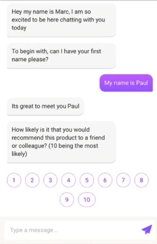
Ignoring what the bot is saying for now, what kind of company do you think that this bot is representing? Would you think it was a traditional company? Or perhaps something a little more fun and funky?
Chances are you’d think the company was unconventional. This would work well in a non- traditional industry. It would fit for a trendy “new kid on the block” with a client base who is less conventional.
Would it work as well for a traditional insurance company with a more conservative client base? Would you consider the company staid and reliable? There is nothing wrong with the colour purple as such, but it’s not going to work in every instance. Purple typically conveys wealth and power. It’s also a colour usually favoured by women.
If you’re dealing with a conservative customer base consisting mostly of men, it could be perceived as too jarring. Let’s compare that with a bot created by our software. You’ll see what we came up within the image below.
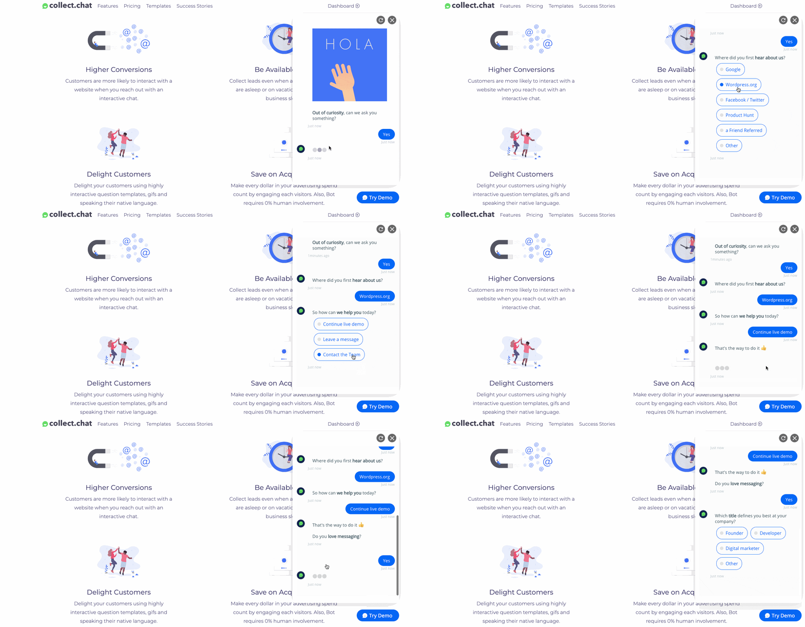
We’ve stuck with a more traditional blue and white palette here. Both men and women like blues and greens. They’re as close to gender neutral as you’ll get.
What about other Colors?
You should choose colours that work for your brand. Here are some other examples to consider:

Red: Is an energetic colour that’s very emotional. It promotes a sense of urgency. Whether it would work well in a chatbot is somewhat questionable. It might be seen as the equivalent of shouting at your audience.

Green: This is another excellent colour selection for a bot. It is a relaxing colour that appeals to both men and women. It’s also unusual in this setting and so could seem fresh and new.

Orange: Orange is also somewhat emotional, but it’s not as in your face as red. A pale orange could make a useful accent colour for a bot. It’s fresh and original and good for promoting sales. It doesn’t have the drama that red does so that it could work well.

Black: At first glance, black might seem a little boring. After all, it’s not even a colour. That said, it also very elegant and seemed sumptuous. This might work well for an exclusive, luxe brand.

Yellow: This sunshine colour is perfect for a brand that’s all about joy. It’s an unusual colour to choose for a bot, and that might be the very reason it could work for your brand. These are just some ideas to get you started.
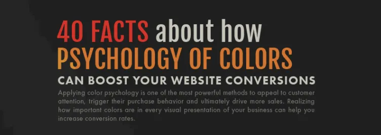
If you’d like to learn even more about the different meanings of colours, check out this infographic from Design Advisor.
Final Notes
When it comes to creating the perfect chatbot, there are a lot of variables to consider, which is why we’ve tried to simplify the process as much as possible: we’ll handle the coding, while you focus on choosing the perfect design elements. Matching your design to your target audience’s expectations is essential for getting the most mileage out of your new chatbot.


