You could have the best-looking website in the world, but if it's not driving traffic, you might as well go offline.
Think of it as people who visit the gym, get personal tours, but never sign up!
Or as people who window-shop at the mall, all day every day
Or worse, people who enter a restaurant, browse through the menu for 20 minutes straight, and then decide to leave.
You get the drift right?
Experiencing a low website conversion rate is essentially a bundle of paradoxes:
1. You experience slower sales even with moderate-to-high customer traffic.
2. You get fewer leads despite investing millions in setting a customer care team.
3. You're constantly barraged by negative feedback on various platforms despite doing your best to stay digitally active and financially afloat.
4. Your user abandons cart at the last moment and never returns despite spending hours browsing on the website.
In a nutshell, no matter what you do, you can't get the numbers on your side. We'll tell you why. It is possible that your website is engulfed in deep-rooted problems in the way it is functioning and more importantly, how users are perceiving it.
So let's look at the top-10 factors that are causing your website to experience consistently dropping conversion rates and what you can do about it:
1. You're Making An Offer That Visitors Are Refusing
Making the right first impression in the website business can make all the difference. Your homepage in this case becomes the 'face of your brand.' If there's too much chaos, your user will never face you again (pun intended). For instance, greeting the users with long and complex sentences, using crammed up content, putting up outdated images and unbearably slow-loading videos etc. can leave them confused, frustrated, and angry.
Simply, if the users don't understand "What's in it for them?," they'll never visit your website again.
A Case Study Worth Considering
Hunter Branch, a digital marketing consultant, boosted SEO traffic for one of his clients by 600% in just 24 months! Sounds hard to believe, right? Here's one of the things he did to enhance traffic from a content perspective:
- He started conducting an in-depth audit of the available content on the website by using Google Analytics and Google Search Console. The results were astounding! He found that out of hundreds of blogs, only ten were driving sufficient traffic. Surprisingly, he unpublished 90% of all the written content.
- He then focused on revamping and republishing the ones that had immense potential but weren't driving too much traffic. Using long-tail keywords and adding more relevant, insight-driven content helped at this stage.
- The remaining blogs that couldn't be salvagedA were kept unpublished to be used for future reference and had 301 redirects to the homepage or other value-driven content assets.
The end-result: Only 30 blogs survived the audit but were generating more traffic than ever!
Let's look at another example.
Story-Telling At Its Best: Airbnb
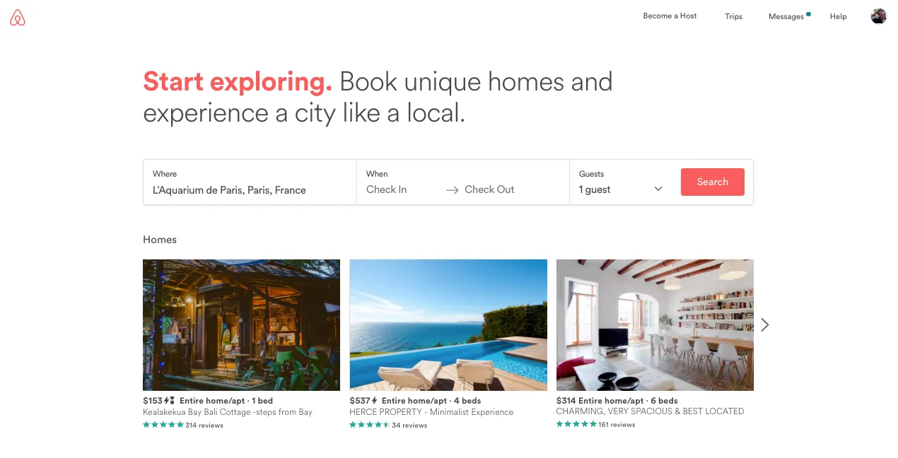
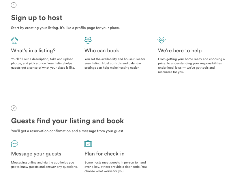
Notice how the brand uses:
- A personalised story-telling technique and uses conversational content to engage users.
- Crystal clear images and full-bleed videos that transport the user into a different world instantly and effectively.
- Icons, minimal content, and a clean navigation layout for a stellar user experience.
Biggest Takeaway: People are hardwired to hearing visually-driven stories, so make sure yours is a beautiful, resonating, and SEO-driven one.
2. Your Web Presence On Mobile Is Making Users Immobile
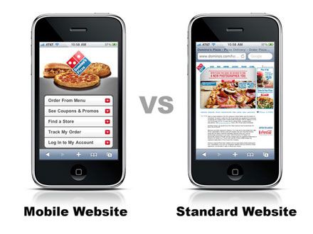
If given a chance, which of the two websites shown above would you like to view? The mobile-optimized one or the standard one? No brownie points for guessing which one would lead to better conversion rates.
Let's take another example: Tell us when was the last time you switched on your laptop to visit Amazon.com to buy those speakers you've been eyeing for ages? We'd say never, right?
Users today are increasingly browsing websites and social media platforms on-the-go. Even with their restricted mobile data connections, they expect a fast-loading website that's optimized for the smartphone of today.
If your users are busy scrolling from left to right and zooming in and out to read the content, chances are they'll never return again.
Plus, you'll lose out on organic search rankings which will definitely plummet your conversion rate to the lowest possible numbers. So make your website mobile-friendly to stay relevant in the user's mind.
3. Your Website is Unreachable - Quite Literally
A website that doesn't offer users the opportunity to reach out to the brand in a logical and clear way is like a hotel which does not have a reception area or a help desk. Unthinkable, correct?
Let's take a look at a bad and a good example of using CTA strategically and effectively.
Here's a bad example where the CTA gets lost in the background:
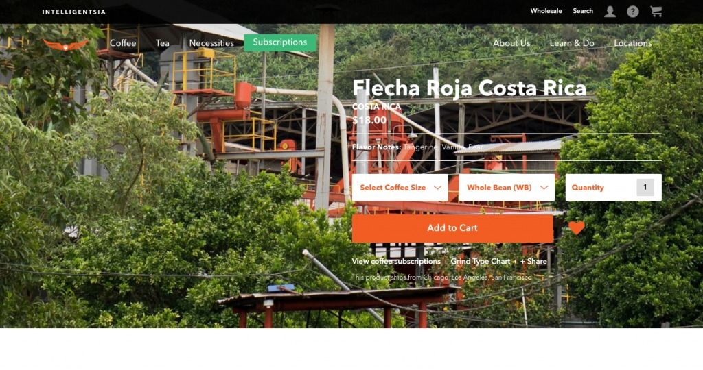
Below, we have a good example where the CTA clearly stands out:
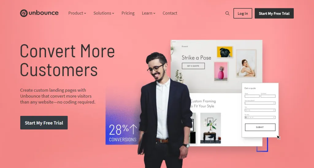
Biggest Takeaway: A 'Contact Us' form no longer qualifies as a dynamic CTA strategy. In fact, it is outrageously generic. The need of the hour is to insert innovative features such as live chat, Call-To-Action (CTA) buttons etc. in your website which empowers users to reach to you anytime, anywhere, and as easily as possible.
4. You're Not Driving Traffic From Different Sources
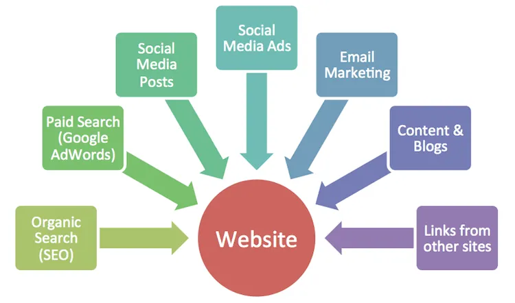
If you're only focusing on getting users via direct means, it may take ages for you to reach your target conversion rate.
Don't get us wrong, getting direct traffic is great. However, your website traffic also comprises of other integral factors such as number of pages clicked, time spent on each section, number of visitors basis the time/day, among other things that need to be tracked and consistently worked upon.
Plus, remember that apart from the direct traffic (when people type out the URL in the address bar to visit your website), you can use indirect marketing means such as email, social media posts, referrals, paid search, organic search etc. to drive more footfall to your website. Whatever be the case, the end-goal must be engage your users, prevent bounce rates/cart abandonment, and ultimately boost conversion rates to an optimum level.
Handy tip: You can track the volume of direct traffic on Google Analytics. When it comes to driving direct and indirect traffic, make sure to align your branding and marketing strategies with your ideal target audience so that they become loyal customers and raving fans of the brand!
5. Users Literally Lose Their Way On Your Website
Poor navigation that's layered and complex or worse, does not have a navigational structure at all - like the one shown below - can leave your users high-and-dry:
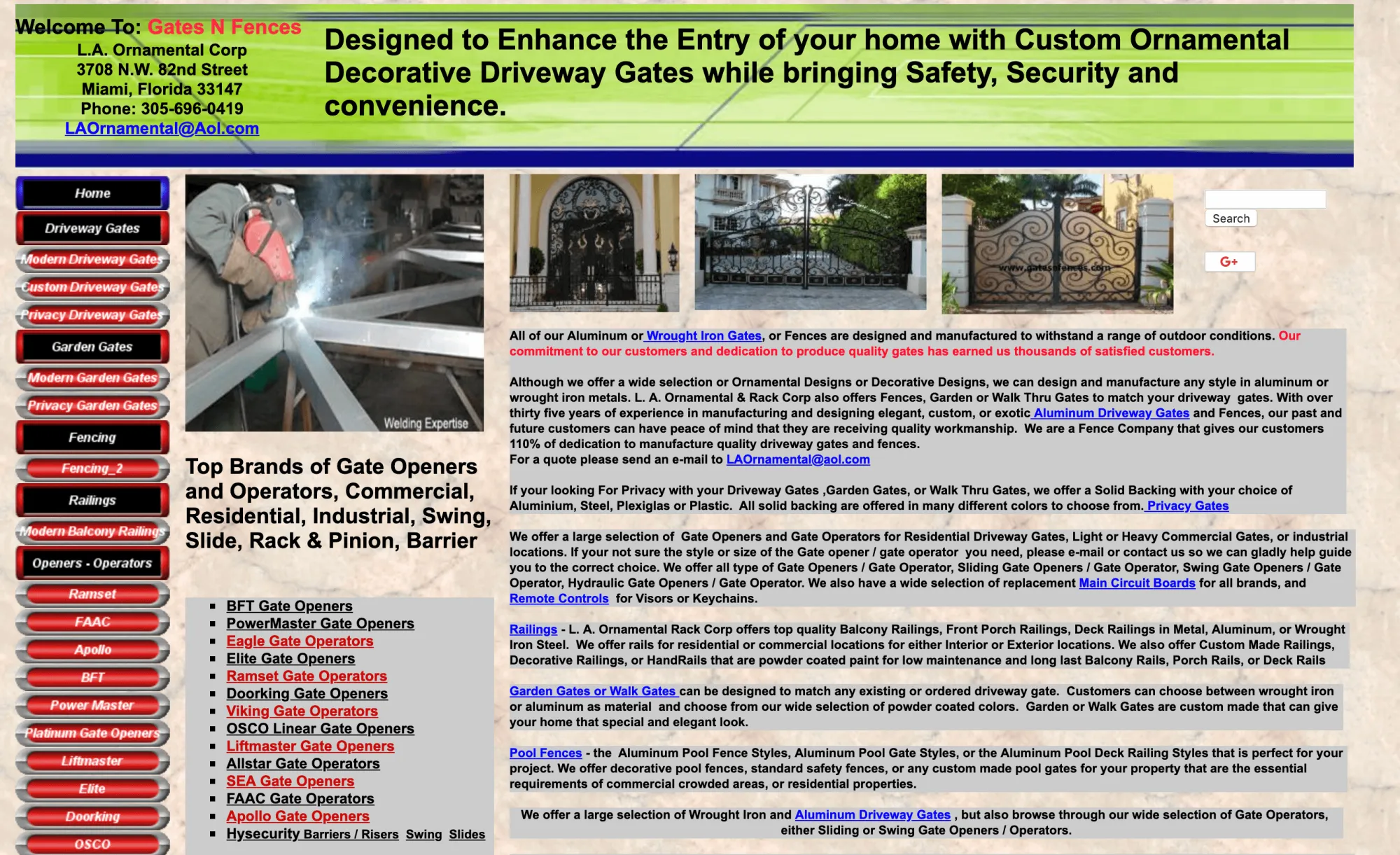
Believe it or not, this is a real website that doesn't segregate its content into a neatly-structured navigation. To top it off, the content font is barely legible, and the unrestricted use of colors is enough to give anyone a headache.
In comparison, the following example by Kiehl clearly outlines a clean navigation structure (even though it comprises of a mega menu) and allows for a seamless user experience - the ultimate goal of every business, right?
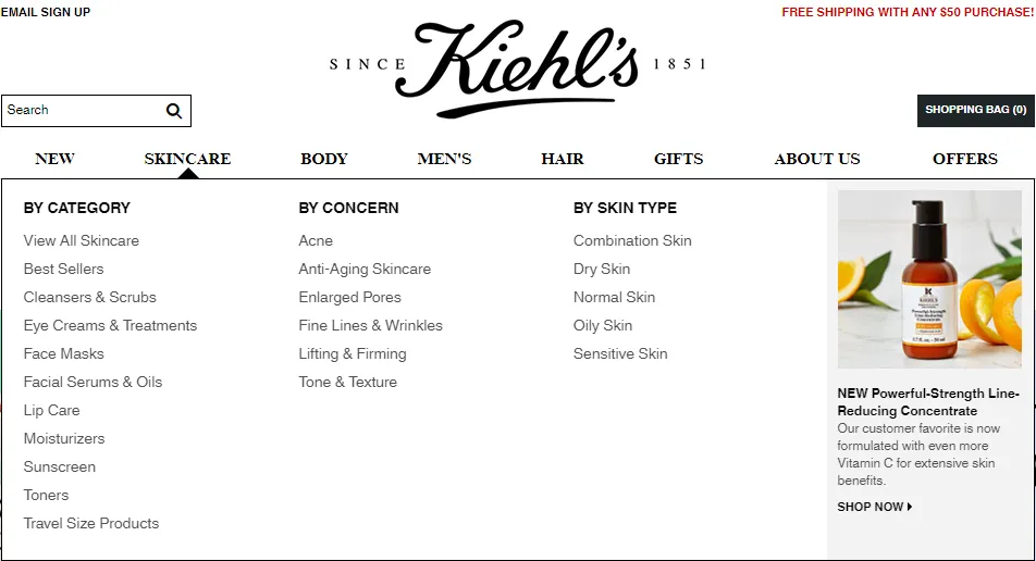
Biggest Takeaway: You can experiment a little and get creative by using the hamburger menu and neatly laying out options for the user. Plus, you should ensure that your navigation is responsive and laid out as clearly and simply as possible.
Three simple questions to ask yourself when brainstorming on navigation ideas from the user's perspective include:
- What's the starting point for the user when they come to your landing page
- Where will they want to go next?
- Which sections did they visit in the past?
6. Your Websites is Forever in the 'Buffering' Status
More than 47% customers today expect a website to load in 2 seconds or less! Additionally, a staggering 79% of customers would prefer not returning to a site with a poor loading time.
There are two things that annoy users to no end. One, involves a slow-loading webpage and two, when Starbucks runs out of the customer's favorite spiced pumpkin latte drink. While we can't do anything about the latter, we can certainly help with the former.
Before we get into the specifics, it is important to understand the importance of having a website that loads quickly and gives instant results. Recently, the Google webmaster team declared that they would start ranking websites based on the page loading time.
Case in point: If you want your website to top the list of Google search engine rankings, you need to accelerate your website's loading speed. Adding further proof, data suggests even a second's delay in page load time can result:
- 11% reduced page views
- 16% lowered user satisfaction
- 7% loss in conversions
Let's take Walmart's case for example. The global brand enhanced their site speed and reaped the following benefits (as shown in the image):
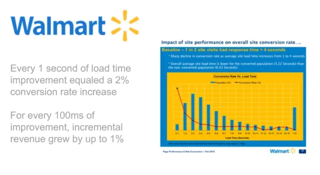
The end-result: It was seen that visitors who converted received pages that loaded two times faster as opposed to those who did not convert. Need we say more?
In terms of steps you can take, there are numerous ways to optimize your website's speed time, some of which include:
- Compressing and optimizing your content and images.
- Placing JavaScript and CSS in external files.
- Enabling HTTP keep-alive response headers.
- Evaluating your plug-ins.
7. Your Landing Page Has Too Many Pop Ups
From auto-playing multimedia videos and gifs to annoying pop ups ads that literally scare the users away, using too many pop ups can act as a total buzz kill for any website.
Users don't need overbearing theme songs, unnecessary animations, flashy advertising, etc. to understand the brand better. It's the era of minimalism and this aesthetic approach works beautifully for websites as well.
That said, brands that use the pop-up feature sparingly and effectively can use this feature to their advantage as shown below:
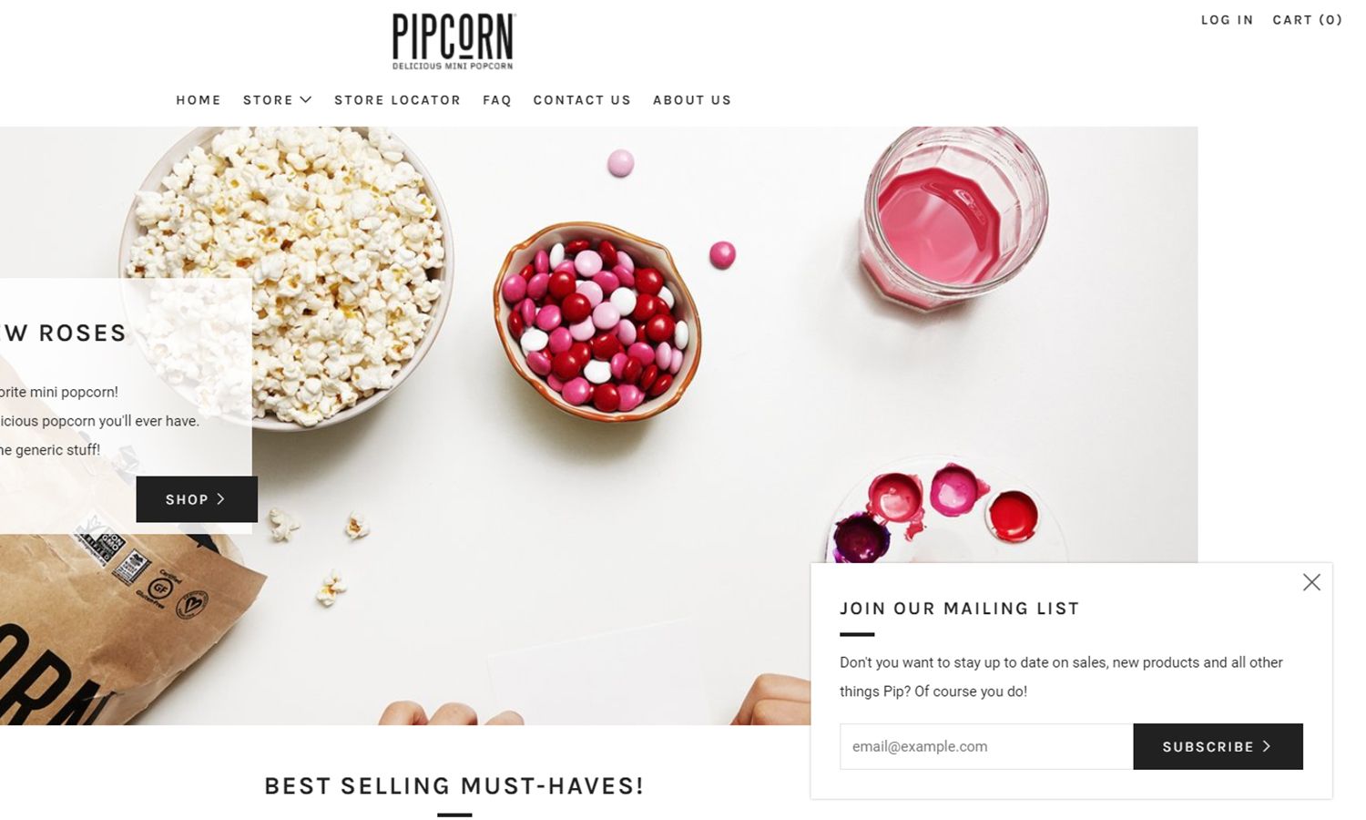
Instead of placing the pop-up in your face, the brand - Pipcorn - conveniently places it in the bottom-right corner, making it feel authoritative and inviting for the users.
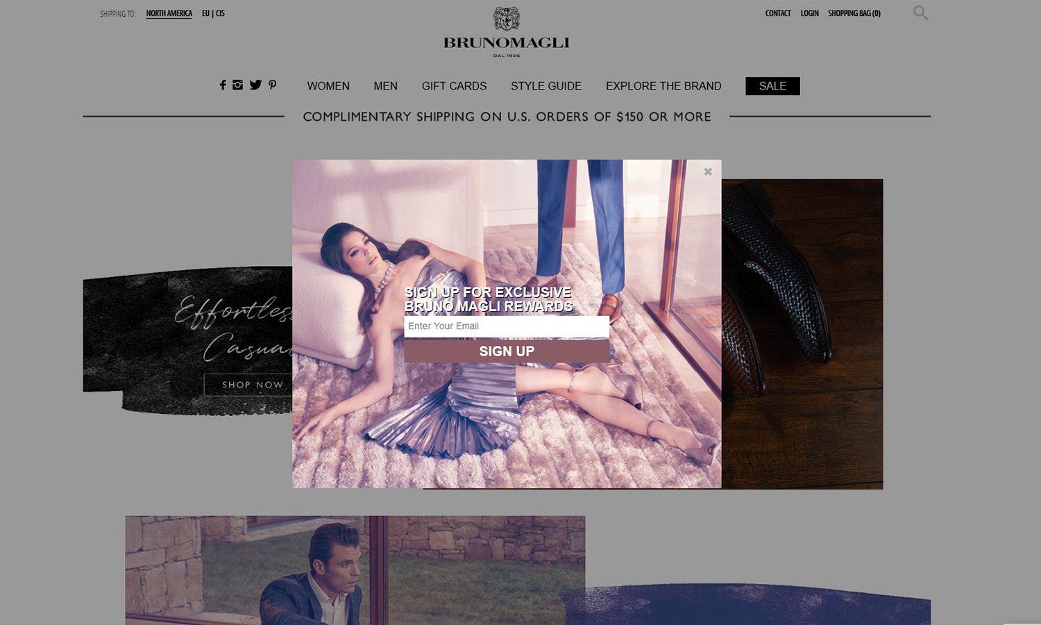
Another brand, Brunomagli uses colorful visuals and crisp copy and delivers on the pop up usage effectively and interestingly:
8. Internal Linking is Absent or Vaguely Inserted
Using internal links to your advantage requires a certain level of mastery and comes in handy if your Google rankings are going down. You want to make sure that you're not overdoing it while budging the users to relevant content.
Plus, you've to ensure that the users get directed to the appropriate pages on your website to improve organic rankings and you want to empower users to feel satisfied and happy as opposed to feeling exhausted and confused when they leave your website.
To achieve this, there are three important things to keep in mind:
- The end-goal should be to improve a visitor's user experience.
- You can try to update old articles with new links. Additionally, for every new article, try to link it to at least 3 old articles.
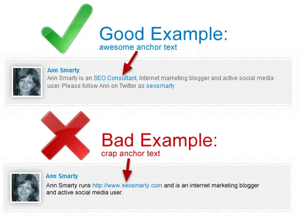
- It is critical that you link the most sensible anchor text instead of highlighting vague phrases to the pages with the highest conversion rates:
9. Your Conversion Tracking Game Is Weak
Believe us when we say that conversion tracking is actually an art and a science. If your SEO rankings are dropping, Google Analytics might be a good place to start. Fill out the form as demonstrated below and let the data-crunching begin:
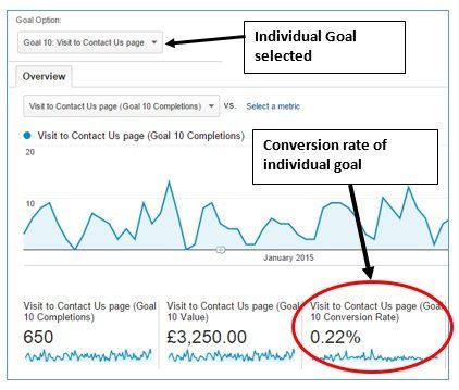
After all, if you're not setting the right parameters to track your conversion rate, you'll never understand where you're going wrong. In the case of website, the trick lies in getting your numbers, data, and analytics in place to drive high traffic and leverage high conversion rates. Plus, remember that all your marketing and branding efforts can be based on this one crucial element.
Handy tip: Google Analytics offers multiple conversion segments for you to pick and choose from such as: Effect of PPC on Organic Search Traffic, Effect of Organic Search on PPC, Effect of Social Media on Organic Search, Effect of Email on Direct Traffic etc.
Final Thoughts: The Most Important Takeaway For Today
All things said and done, if you're not embracing the above mentioned strategies, your conversion rates will forever remain on the lower or non-existent end.
But, if you don't know how and where to begin, we suggest start you start by investing your time, energy, and resources into integrating a conversion tool can be on the site that can help:
- Measure the conversions accurately.
- Attract the right audience, at the right time, in the right frequency.
- Improve the website's functionality and usability based on the user's requirements and feedback provide.
In our humble opinion, the best way to achieve this is by having humane yet intuitive conversations.
We all know that the evolving chatbots of today are more than capable of:
- Driving engaging conversions.
- Allowing your website to enjoy an ever-growing traffic through iterative improvements.
- Offering valuable insights into genuine vs uninterested buyers.
- Providing a holistic perspective of where your business is and where it is heading from a user's view point as well as from the marketing perspective.
We'll leave you now with enough food for thought. Take your time and rethink your conversion optimization strategy with informed decision-making and data-driven website optimization strategies highlighted above to guide you on your website conversion journey. All the best and Godspeed!


